The context
Designing convenience at scale for 3,500+ gas stations in Brazil. Redesigned Shell’s station locator and promotions experience — boosting engagement by 30% and supporting 3,500 gas stations and 500 convenience stores nationwide.
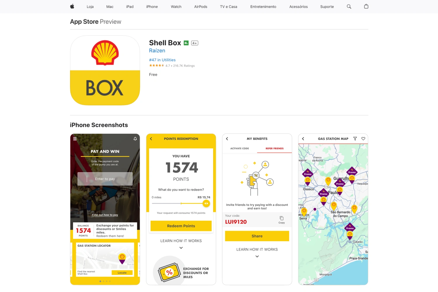
Shell Box is Shell’s flagship mobile app in Brazil, offering users an easy way to find gas stations, pay for fuel, and access promotions. At the time, the station finder was functional but outdated — search was slow, promotions were buried, and the experience lacked real-time context.
As the product designer, I led the redesign of the locator and offers experience, simplifying navigation, surfacing dynamic promotions, and aligning every touchpoint with Shell’s global brand guidelines.
The sequence separates entering a pump code, choosing a payment method and confirming the result.
The redemption screen puts the points balance and conversion choice before the action.
Tabs distinguish inviting friends from activating a benefit.
The map connects nearby locations to promotional context.
Highlights
Challenge
Strategy
Execution
- Designed high-fidelity flows for station search, filters, and promotional highlights
- Created a modular style guide to ensure brand consistency across all platforms
- Partnered with devs to roll out improvements across Shell Box’s vast retail footprint
Impact
3.5M+
110K+
40M+
30%
The webpage introduces the app in the context of paying at a station.
A short sequence explains registration, payment setup and station discovery before the benefits.
What I Learned
Designing for large-scale retail environments taught me the importance of structuring flows around real-time context (location, promotions, checkout) and supervised localization. This experience underscored how enterprise UX at scale demands strong design ops, well-documented UI specifications, and collaboration across regional product, dev, and business teams.