The context
Designing a management dashboard that saved time and increased control. Created a user-centered dashboard for Shell station managers, streamlining workflows and reducing operational friction across 3,500+ gas stations.
Shell needed a digital solution for managing day-to-day station operations. Paper-based processes and outdated tools made it difficult for station managers to get real-time data, track performance, or resolve issues efficiently.
I led the design of a business-facing dashboard tailored to their real needs — by shadowing managers, gathering direct feedback, and turning those insights into usable, scalable workflows. The final product aligned fully with Shell’s global brand guidelines while solving tangible on-site challenges.
The login task stays compact and separate from the supporting photograph.
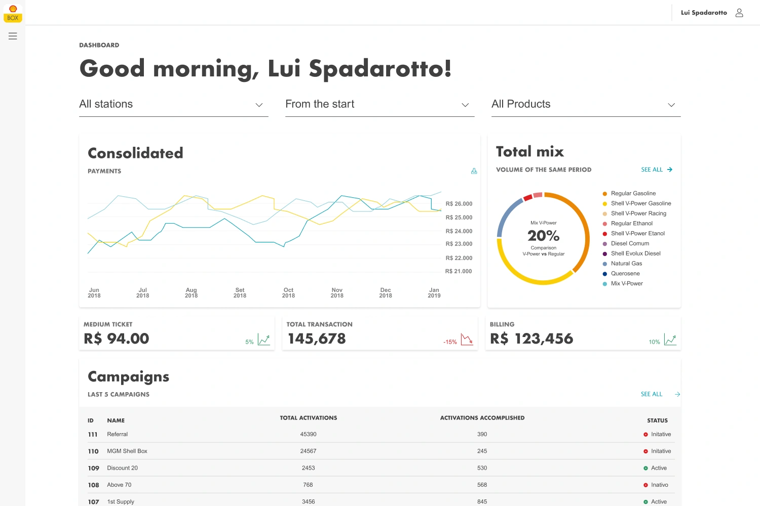
The dashboard moves from summary charts and key figures into campaigns and reviews.
Summary figures establish scale, while the table supports inspection of individual records.
Campaign totals and the chart give an overview before the status-based list.
Highlights
Challenge
Strategy
Execution
- Shadowed Shell station managers to gather first-hand insights
- Designed a task-focused dashboard with real-time alerts, reports, and KPIs
- Built high-fidelity prototypes tested and iterated with target users
- Followed Shell’s global design standards to ensure visual consistency across regions
Impact
25%
Faster
Higher
Consistent
Visual template previews make the starting options concrete.
The offer preview sits alongside the rules that govern it.
What I Learned
This was a masterclass in designing with empathy and proximity to operations. By embedding myself in the station managers’ routine, I learned to prioritize speed, clarity, and relevance over aesthetics. I also deepened my experience working with strict brand systems and high-regulation environments, delivering a polished B2B product that genuinely supported frontline needs.